top of page


HOUSTON TEXANS
NFL RIVALRIES 2026
The Concept
NFL Rivalries is an exciting new addition to the NFL where the 4 teams in a division from both conferences reveal a special alternate uniform that goes beyond the teams usual wardrobe. This offseason, we're putting together our own concepts for this year's teams.
For the Texans, "Space City" immediately jumped to mind, and we got to work creating an identity based around Houston's rich space history. At the core of this concept is reimagining the Texans in a way that explores the unknown while also drawing from the city's rich history and the team's identity.
Logos & Motifs
Script Wordmark
Classic script features a spaceflight trajectory & the Texas star.
Simplified Script Mark
The 'H' logo is simplified particularly for use on the helmet, allowing the star feature and trajectory to shine.
"Liftoff" Motif
A modified version of the classic horn shape, the motif continues the space theme but retains the Texans' DNA.
Uniforms

Helmet

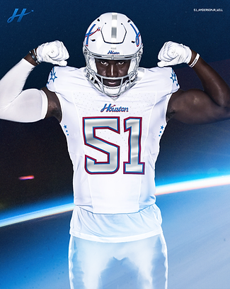
Features the script H logo while emulating a space helmet with a metallic grey stripe and a metallic grey facemask.
Jersey

Metallic grey numbers on white invoke the space suit theme, while the new word mark and motifs are able to shine on the chest and shoulders.
Pants

Silver pants with a white and blue dual-stripe calls back to the iconic shuttle carriers used to transport spacecraft in the 80s and 90s.
Social Media Content
New uniforms are a special occasion for creative teams to flex their muscle and unveil unique branding that breaks from the overall identity used throughout the season. Leaning into the space theme, we created mock content for both the uniform reveal and for a specific rivalries game week.


Behind the Scenes
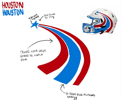

Initial concept included the flight path logo on the helmet, intended to replicate the Texans' horn shape with space elements.


We decided to add a new script word mark to capture a timeless feel, while still integrating the star and flight path. This wordmark also served as the base for the simplified H logo on the final helmet.


The uniforms went through a variety of iterations to determine the best way to achieve the space-like feel that we wanted. Ultimately decided on use of metallic silver alongside the H-Town Blue and classic red accents.


The social media presence for rivalries week naturally leaned into the space theme, using imagery from NASA and featuring gameday visuals that got progressively darker as the game went on.


bottom of page